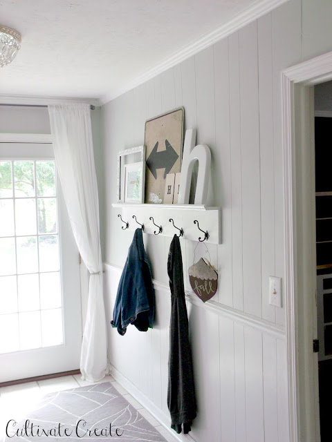
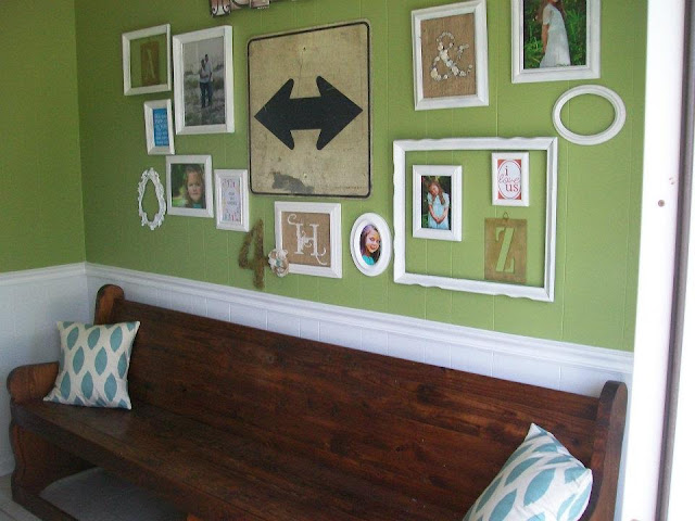
Over the last couple of weeks, I slaved away at painting over the horrid green that had long since given me mental design blinders in the main living areas of our home. When I first painted the green three and a half years ago, I felt it was cheerful and fresh. I wasn't (and still am not) afraid of color and I embraced it. However, I never could get the room to be quite "right". It just never felt cohesive or anything like what I had envisioned for it. And the room ALWAYS photographed a lot greener and neon than it really was. After much lamenting about the HUGE job it would be to paint that large of a space, I just bit the bullet and did it. (And thanks to my friend Ashton for helping me out one day!) It didn't hurt that I was to host a baby shower for one of my best friends this past weekend, so having a deadline put me into high gear to get it all done.
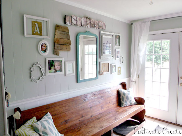
Let me tell you, it was soooo worth it! Once I got it finished, I could almost physically feel a weight lifted off my shoulders. It's like the green pressed down on me and kept me from being able to really progress as far as decorating goes. I was completely and totally stuck, to tell you the truth. The gray has lightened up the space and given me a fresh perspective on what all is possible in the space. I LOOOOOVE it!
I went with Gray Owl by Benjamin Moore. It was the one that didn't read too purple or too blue. It seemed to be just the right shade of neutral for our space. Picking out a paint color was hard, but once I saw the different shades in various areas of our home at different times of day, the choice was easy.
I really feel that my design tastes have matured a bit. I know myself and what I like a little better, and have a better sense of how to pull a room together. (I am by no means an expert. I still have LOTS of learning to do, but I feel like I have grown a lot.) Anywho, this feels like a much more grown-up space. It's almost like I have finally embraced that I am an adult. That concept is still really weird to me because it feels like I was 21 yesterday. But, nonetheless, I'm loving our new "grown-up" space.
Just to give some perspective of the work we've done since moving into the home, I'm including some before, during, and now photos. I obviously have a pretty blank slate right now. My next step will be to add in some warm wood tones to warm up the space, lots of textures, and small pops of color. Here's the progress in our home:
Butler's Pantry:
 |
| Before: when we first moved in. |
 |
| What it looked like the last three years. |
 |
| Now. This space is hard to photograph because there isn't any natural light right here. |
Kitchen:
 |
| Before |
 |
| During |
 |
| Now. I can't believe how much the gray paint lightens up the space! |
Dining Room:
Looking into kitchen from dining room:
 |
| Before |
 |
| During |
 |
| Now |
Side Entry:
 |
| During |
I'm still amazed at how different our spaces look now! I really, really, really love it! I can't wait to find some really pretty wood tones to add into the rooms and to see how seasonal decorating plays out with a neutral gray background. Stay tuned for my fall home tour!
Linking up to:


No comments:
Post a Comment